The opening · free to read
Text format:
In the printed book, line numbers were squeezed in wherever there was room. For the e-text, they have been regularized to the EETS-standard multiples of 4. Line divisions and page numbers were retained for use with the Index and linenotes, except that some very short words have been moved up or down to avoid awkward gaps. Headnotes have been moved to the nearest convenient line break.
Italics representing expanded abbreviations are shown in b{ra}ces. Other italics are shown conventionally with lines. Superscripts are shown with ^ (caret); they always continue to the end of the word. Oversized initial letters are shown with double leading ++ as ++A. In the Appendix, decorative final letters are shown with single + as dar+, sprong+. Italic thorn (þ) and yogh (ȝ) seem to have been unavailable to the printer; both letters have been formatted to match the surrounding text.
The inverted semicolon (rare) is shown in brackets as [;]. All other bracketed letters or letter groups are in the original.
In the primary text, anomalous spellings with initial “u” or non-initial “v” are not individually noted. Other errors, whether corrected or not, are listed at the end of the e-text.
For this e-text, Chaucer’s translation of the Consolatio is given twice: first as printed, with all notes and apparatus, and then as text alone.]
Chaucer’s Translation of BOETHIUS’S “DE CONSOLATIONE PHILOSOPHIÆ”
The book keeps going
Keep reading, and see it illustrated
Reading is free forever. Sign up and watch scenes appear while you read.
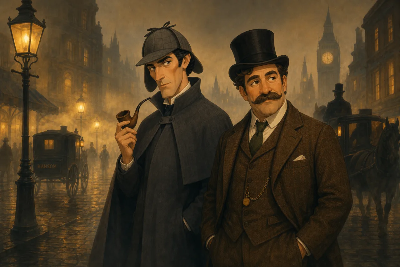
Scenes Storieta drew for other classics.